A river that reports itself
A volunteer-run river conservancy needed water-quality data it couldn’t afford to staff. A student engineering team built the instrument; the design question was who would read it. Formative work, and the first time all four trades pulled together.
The stuck thing
The Lakeside Conservancy watches a stretch of the San Diego River with volunteers and grant money. Water-quality reporting demanded continuous measurement: state boards wanted standardized data, the conservancy needed same-hour alerts when something went wrong, and hand sampling delivered neither. The river changes faster than a volunteer can drive to it.
The diagnosis
The instrument was the easy half. The data had four different readers, each needing a different shape: conservancy staff needing real-time readouts, alerts, and sensor-calibration workflows; the state’s SWAMP database with its transfer protocols; a public that deserved to know what the numbers mean; and teachers who could turn a live river into curriculum. Design the interfaces first, from the readers back to the sensors, and the system’s architecture follows.
Made it go
I came to this as the first student to join UCSD’s Teams in Engineering Service from outside the engineering majors: a cognitive science undergraduate asking to do interdisciplinary design work in engineering. I served as community client liaison, external liaison, and lead for user-centered design: investigated the conservancy’s operations and physical plant, defined the user groups and requirements, and planned the network infrastructure, a solar-powered sensor rig in the water linked wirelessly to a database and web server in the office.
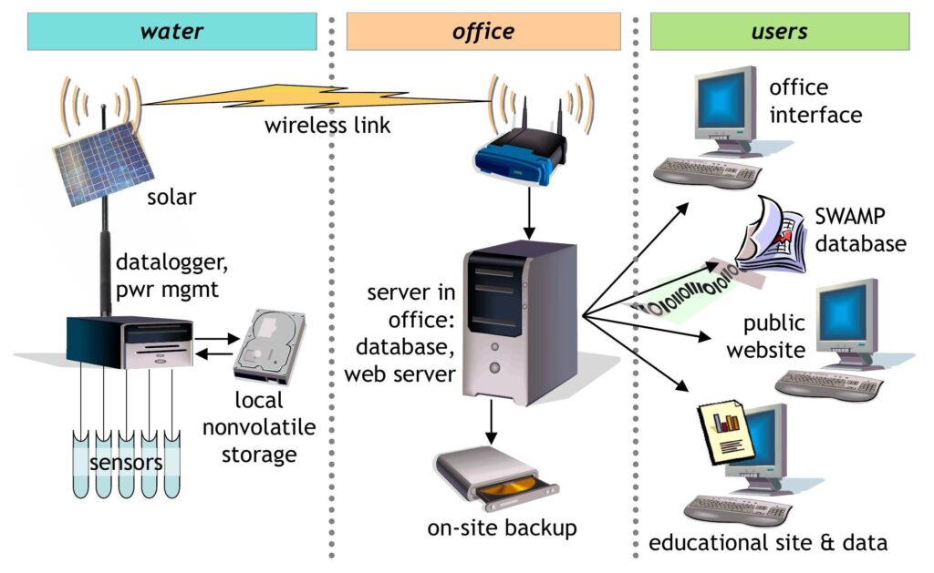
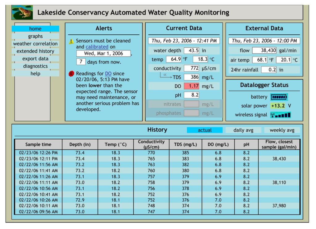
The office interface design carried real-time readings, threshold alerts, weather correlation drawing on NOAA and NWS feeds, and diagnostics down to sensor calibration; the outward paths carried standardized transfers to the state and regional water boards, a public site explaining the readings’ significance, and an education interface mapped to California science standards. Along the way I devised collaborative tools so the team itself worked in a more integrated way. The team rated the work “exceptional”; so did the advisor.
user-centered design · systems architecture · requirements & scoping · client liaison · interdisciplinary teamwork
← All work · Have a stuck thing? Tell me about it →